Date
June — August 2024
Role
UX Design Intern
Key skillsets
Quantitative Research
Web Accessibility
Responsive Design
Tools
Google Analytics
Jira
Figma
From experienced Appian users to potential prospects, Appian Documentation informs people’s impression of Appian directly. 144,000 people use the Appian Documentation site every year and yet the design of the site was not updated for the past ten years.
Design Process
1.
Project Proposal
4.
Concept Test
7.
Branding
8.
Development
2.
Understanding the Problem
5.
Mid to High Fidelity
9.
Responsive Design
3.
Low-Fidelity Design
6.
Usability Test
Project Proposal
Modernizing the Documentation Site
After a week of onboarding, I was officially placed on the Information Development team within the Product Enablement group, where they are responsible for developing all technical documentation for using Appian. Following the initial project kickoff meeting, I was given a document titled “Doc Site Modernization Project,” which contained links to over 40 other documents. I was then tasked with redesigning the documentation site based on two key requirements:
1. A new design for the Docs Home page that better aligns with what users are actually looking for.
2. A refreshed look and feel for the Docs site that is consistent with the new Appian Community brand.
After the initial 30-minute kickoff meeting, our product manager requested that I create a low-fidelity mockup by the end of the week.
Understand the Problem
User research with a tight timeline.
With only a week to create a design vision, I was challenged to come up with something despite having no prior context. Even though the design was low-fidelity, it was still difficult to proceed without a deeper understanding of the project. What are the different use cases for the documentation site? Who are the various personas? What is the user journey of an Appian user who would want to use the documentation site? My mind was immediately flooded with questions that I needed to answer before I could begin sketching. Given the tight timeline, I developed a research plan to gain a solid understanding of the problem space within the time constraints.
Prioritization
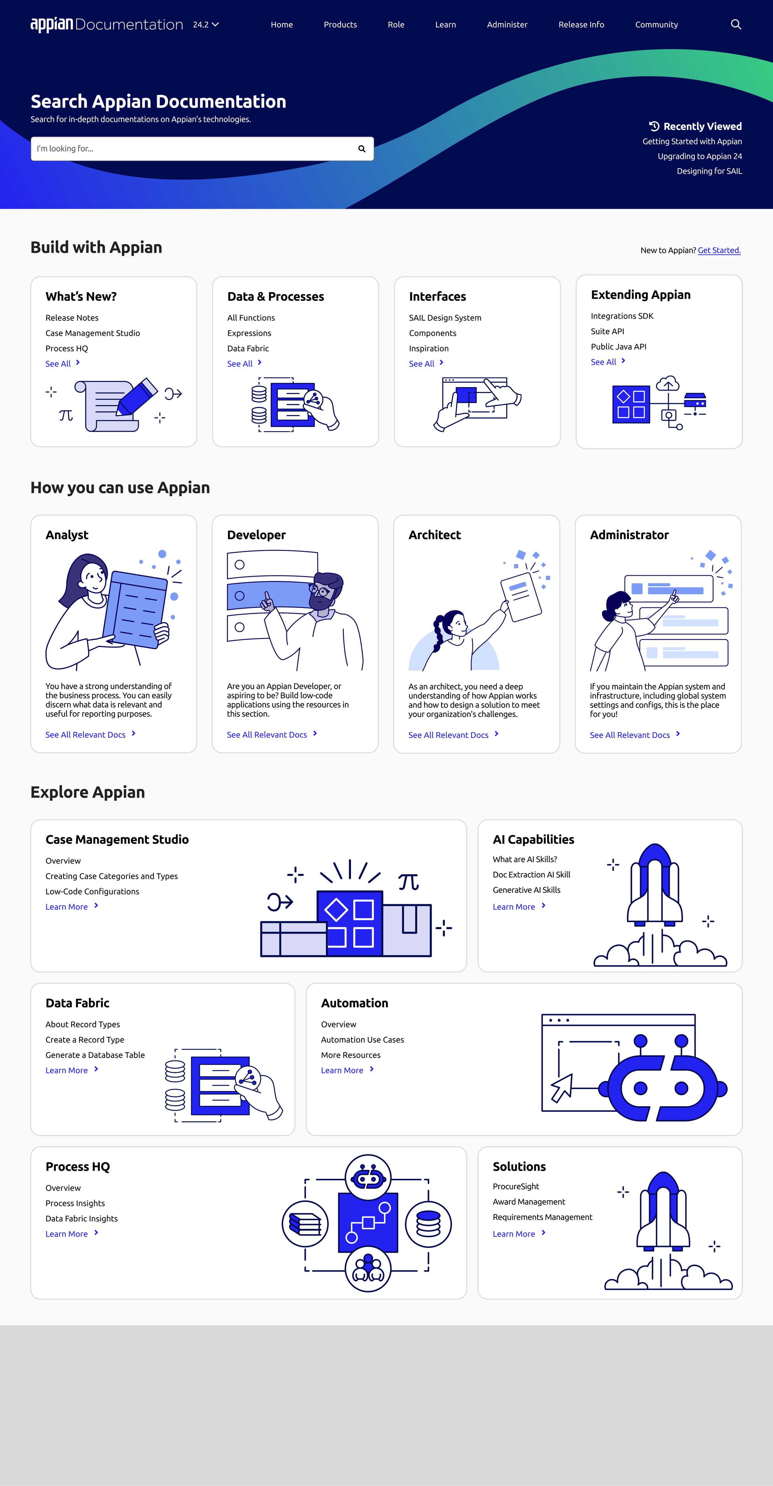
To maximize efficiency during the research phase, I focused on identifying which parts of the documentation website required the most attention. In other words, I aimed to determine which areas of the site had the highest impact and were the most urgent. After reviewing the project proposal to better understand its scope and analyzing visitor traffic on Google Analytics, I decided to take ownership of the research and design for the homepage.

The current Appian Documentation home page.Competitive Analysis of Doc Site Home Page
I began the research phase of the project by gaining a deeper understanding of the competitive landscape. I wanted to see how similar businesses present their product information to users and identify design opportunities for Appian’s documentation. Through this process, I observed both standard practices and unique design elements from various companies. I primarily focused on competitors such as Microsoft, ServiceNow, Salesforce, and Oracle, as they are direct competitors and were mentioned in our user survey as documentation sites that people enjoyed using.

I divided the research into four categories: Navigation Menu, Search, Release Notes, and Content. These are the four most prominent and frequently used components on the documentation site. I then visited competitors’ documentation sites to study how they approached designing these components. I took screenshots and added sticky notes next to each one to provide captions for later analysis.

I then grouped the sticky notes into common themes and came up with a list of insights to inform my initial iteration of ideations.
Insights
1.
2.
3.
The search bar tends to be the prominent feature on the documentation home page, along with federated search capability.

Featured or recommended contents are popular to have on the home page. Browsing or showing the entire product directory is secondary to the featured items.

Most doc sites do not highlight new releases as the key element on the home page. They only provide information for users who are interested in learning more.

Low-fidelity design
Initial Concept Exploration
After two days of desk research, I started to explore ideas to see potential project directions. I came up with 8 different initial wireframes. The goal of these wireframes is purely about exploring how information can be displayed to users.

At the end, I have combined several ideas and fused them into one. Ultimately, I have finalized on two ideas that I wanted to test further with participants who actively use Appian Documentation site.

Option A

Option B
Design Review / Concept Test
Initial concept validation
To validate whether my findings from the competitive analysis were correctly implemented in the design, I scheduled six concept testing sessions to gather feedback on the two finalized mockups. The goals of the concept tests were to:
Understand the mental models of each persona for the documentation site.
Assess the effectiveness of information retrieval in individual sections.
Determine the best possible combination of sections for the homepage.
Gather new insights and feedback to identify any unaddressed user needs.
The research questions I aimed to answer to achieve these goals were:
How do different personas (developer, admin, designer, analyst) respond to the mockups?
How much of an improvement is the new design compared to the current documentation site?
What is the best combination of sections for the homepage?
Are there any new sections that could be designed to enhance the user experience?
To capture the perspectives of all users, I reached out to both experienced and new Appian users for the concept testing sessions.


To analyze the qualitative data from the concept test, I separated the data into two categories: experience users and new users. I did an affinity map to find the commonalities for each of these user groups. Then I compared the findings from both user groups to see if there are any overlaps or contradictions.
Insights
1.
Not only does experienced users use search, new users use search even when they don’t know the specific Appian term.
3.
More research on how new the visitors of Appian Doc are is necessary in order to craft the ideal experience people want in “start building on Appian” section.
2.
“Release Notes” and “What’s New” are most applicable to experienced Appian Developers. Yet, they still do not find the current way of displaying release notes information to be the most optimal.
4.
More research on how new the visitors of Appian Doc are is necessary in order to craft the ideal experience people want in “start building on Appian” section.
Key Insight
From this concept test, I was able to identify the specific user group for the Appian Documentation Site. The target audience is not brand-new or highly experienced Appian users, but rather those who fall between these two extremes. The Documentation Site supports users’ learning, and the homepage should be designed to guide them on a personalized learning journey.
Mid to High Fidelity Design
Iterative design process
With a better understanding of the problem space, I started to rapidly iterate through ideas by incorporating the research insights.

Usability Test
Validating hi-fi design
Option A

Option B

The primary research goals are to understand users’ mental models regarding role-based user personas, gather feedback on the new homepage design, and validate previous design decisions, such as the order of sections, the placement of release information within the “Build with Appian” section, and the inclusion of popular documents in the featured content area. The research will use an A/B testing method, comparing two options: Option A, where role names are presented as links, and Option B, where role names are displayed with descriptions. Participants will be encouraged to think out loud while scrolling and interacting with the site to provide additional insights.
Affinity Map

Insights
1. Card design
The current card design does not afford the ability to click for some users.
2. Build with Appian
“Build with Appian” is effective in providing users with quick access to the links they need most for their day-to-day activities.
3. Pick your role & pick your skill
The titles “Pick Your Role” and “Pick Your Skill” make users think that the home page is more like a questionnaire rather than a collection of links.
The roles section offers positive user experience for those browsing the doc site and who are new to Appian overall.
Users generally preferred Option B (with description) over Option A, as it provides more context for the specific role.
Users are concerned about the ability to see other relevant resources when clicking into the specific role.
4. Featured Content - Bento Box UI
The design of the bento box introduces some information overload.
Users are confused about why features are “featured” to them.
The section title “Featured” gives users an expectation, not necessarily a preference, of needing to see it at the top of the page.
Branding
Design at a big corporation
This is where I realized that design decisions are often driven by multiple factors at a corporation. Often times, designer’s favorite design never makes it to the final product due to various of reasons that is out of a designer’s control.
This is the original graphic I wanted to use on the doc site website. I wanted to use it on both the open graph preview as well as the main header for the home page. This graphic is known as the “swoop” at Appian and was created as a new graphic for the Appian’s new marketing campaign “Orchestrate Change.”

When I showed my design with the “swoop” graphic in the UX review, everyone loved it. People enjoyed seeing the refreshed look of the site and how the "swoop” was able to guide people’s eye across the screen. I was just excited to see this on the real website as many of my colleagues. Therefore, I reached out to our marketing team to ask for permission and for additional support.

At first, I got the initial approval from marketing to use the “swoop.” I was told to even directly grab the swoop design element straight from their illustrator file. Therefore, I started to use the swoop element to idea on the possible design for the open graph preview image. This is the image that people would see whenever they share a doc site link with someone.

When I shared my progress with my point of contact at marketing, I was told the exact opposite of what they initially said to me. I was told to halt the design exploration until they figure out what to do with the “swoop usage. My team decided to implement it as is and we’ll assess the situation if marketing explicitly says that my team can’t do it.

One month later, my PM announced to us that marketing has decided the “swoop” only belongs to the “orchestrate change” marketing campaign. This means that whenever this graphic element is used, the marketing tagline “orchestrate change” has to go with it to maintain the consistency of the campaign. Ultimately, I was told to remove the “swoop” from all of the graphics on both shared link preview and the search banner in doc site.
So what’s next? All the design I worked on involved some sort of “swoop.” Now, all of them are not usable. The only thing I could do now is to revisit the graphic and design something new.

Therefore, I came up with something that strictly followed our brand guidelines: the angled lines. I ideated on the search banner based on the design language and the common graphical element. However, after the UX Review, we didn't really liked the angled lines design at the end and decided to go with something that aligns more with the design language of appian.com.

Final Open Graph Preview

Final Search Banner
When doing design at a corporation and when your project has such a high visibility, everyone is going to want to have a say in the final outcome of it and everyone is going to have a different opinion on the design. A designer's intent may start with simply "how do we make the user experience better" but often times that initially proposed ideal design would have to change based on business and technical constraints. Designer's intent is not at fault but rather it highlights the significance for designers to also consider the business value when defending their design decision.
“
It is fundamental for designers the articulate user value. But to drive change and have real impact, designers have to also articulate business value.
”
Development
Creating a pixel-perfect MVP
Devs are a great resources to gather design feedback, especially when they also care about the look and feel of the design. In the doc site project, our devs are specifically web developers. They care a lot about the look and feel of the design and they care about if the design that we built is something they want to work on. They demanded my design to be pixel perfect.

These four cards make up the first section of the home page. At first glance, the illustrations look aligned well in the card. However, when we isolate the illustrations out, you will soon realize that they are actually not mathematically aligned.

Though they’re not mathematically aligned, they’re optically aligned. So how did I go about optically aligning every single illustrations in the card?

The trick is to blur the illustration. Once you blur your illustration, it removes a lot of irregularity in the shape and provides you a better sense of visual weight of the illustration perceptually. Then you align your blurred illustration to your best judgement and now you have a perfectly optically aligned irregular illustration in the card!
Without my devs demanding me to have a pixel-perfect Figma frame, I would not discover this neat method of optically aligning irregular shaped illustrations. I am proud of the quality of work that my devs demanded and, as a result, I am proud to say that the work that we're shipping has a very high standard of craft.
Responsive Design
Consider what’s usually deemed as out of scope.
When working on a high-visibility project, it is crucial to consider all the ways people will use the site. Responsive design is often overlooked in school projects, as students typically focus on either a mobile or web app and build the UI around that specific platform. However, in the corporate world, where a product is used daily by over 4,000 active users, it is essential to accommodate all the devices people might use to access the documentation site. According to Google Analytics, 15% of users access docs.appian.com on mobile devices. As a result, responsive design—often considered “out of scope” in school projects—became one of the most important factors to address.
20,000 users per year use doc site on mobile.

Material UI - Responsive Design (source: https://m2.material.io/design/layout/responsive-layout-grid.html#breakpoints)
To determine how we should approach designing the web page to be responsive, we first conducted some best practices research. We learned that we should first identify the breakpoints for different screen sizes. Therefore, we took inspiration from the Material UI’s breakpoint system and used it as a reference to defined our own.

Large (Desktop)
Expanded (Laptop)

I ultimately created three variations of the mobile design: one with illustrations, one without illustrations, and one with horizontal scrolling. After consulting with a UX expert in mobile design, we first eliminated the horizontal scroll option, as it significantly reduces content discoverability. We determined that it is more important for users to easily find content within each section rather than discover all the sections available on the homepage. Next, we eliminated the option with illustrations because they served a decorative purpose and did not play a critical role in explaining the functionality of the categories. Removing the illustrations also reduced the need for users to scroll excessively to access additional content on the page.


Medium (Tablet)