Jan 2023 — Dec 2023
Date
Product Designer
Role
Heart of Passion
Client
User
HoP Students, Mentors, Admins
Heart of Passion
Heart of Passion is a non-profit organization based in Atlanta that seeks for ways in fostering a supportive environment for teens who have cancer. One of the ways that they do it is through enabling teen leaders (high schoolers) at Heart of Passion to organize summer retreats for teens with cancer to foster connections with others going through similar experiences and create lasting memories.
X
Bits of Good
Based on the initial project proposal, Bits of Good is able to design a planning and budgeting interface that would replace the organization’s current massive Excel file and allows users to track the flow between raised funds and planned spending, plan retreats, plan fundraisers, and organize donor data.
An Unclear Project Scope
Heart of Passion’s Vision
When Heart of Passion proposed the project to us, they shared the problem they were facing: an unorganized approach to budget tracking. However, the problem they are facing is rather vague. There are a number of ways that may contribute to their unorganized method of budget tracking. For example, it may be due to an unorganized method of training the users (high school students) to use the Excel sheet, or it may be a workflow flaw in their organizational structure. To truly solve their problem, more in-depth research is needed.
Bits of Good’s Challenge
The way Bits of Good handles a project is heavily constrained by the academic schedule at Georgia Tech. Since BoG is an extracurricular club at GT, we only work within the semester for 10 weeks. What often happens is that user research and design development do not have enough time to get ahead of development needs, as all departments in the club start on the same day. There are a total of five sprints in a semester, and the design team for a project gets a specialized Sprint 0 to conduct user research. The timeframe for design before we can send it to the development team is roughly two weeks. This is definitely not enough for the design research needed to address the vision and problems Heart of Passion is facing. Therefore, a new method of organizing this particular project is proposed: a design-only semester.
To properly address the ambiguous project scope for Heart of Passion's request, we have chosen an unconventional approach by dividing the project into two phases for two semesters: design and development. We dedicated an entire semester to defining the problem space, designing iteratively, and preparing a fully fleshed-out design for development in the following semester.
Design Process
Understand the Proposal
1.
2.
Client Interview
User Interview
3.
4.
Need-Finding
Iterative Design
5.
Development Process
1.
Sprint Planning
2.
Design for Dev
5.
Insights/Impact
Usability Test
3.
Implementation
4.
Design Semester
Designers: Yiwen Zhao & Zeyna Abdulla | PM: Aparna Arul
Heart of Passion’s Current Situation
Understand the Proposal

Currently, Heart of Passion has been using this template on google sheet to document and track their budget. Each student chapter of Heart of Passion is responsible for organizing a four days summer retreat. Individual chapters are responsible for maintaining their own budgets for the retreat using Google Sheets. All budget-related information is manually updated and up-kept. There is no organized way of determining the “final destination” of where the donations go/what they were used for. There isn’t a lot of visibility on where money is spent. Students also struggle to fully understand how to navigate through the budget with this google sheet. To further understand how HoP uses this spreadsheet, we decided to conduct a client interview with the founder of Heart of Passion and several user interviews with their high school leaders.
But wait… Where did the money go?

It is critical to understand the budget for Heart of Passion because one of their main event every year is called “Red Carpet Day.” This is essentially a four days retreat that is planned by the high school leaders trained under HoP to help teens who have cancer to take a break and have fun. The high school students would need to plan out an itinerary for the retreat and find out how much money they need to spend in order to make the retreat happen. Then they need to raise that amount of money in order to truly make the retreat happen. A clear understanding of the budget is critical in planning the retreat.
User Workflow Based on Client Interview
Client Interview

Through the interview with our client, we were able to quickly identify a workflow that matched how she described the high school students' current utilization of the budget for planning the retreat. The process of budget tracking and retreat planning appears to be quite linear. The overall process can be broken down into three main phases: retreat planning, fundraising planning, and validation.
We showed this flowchart to our client to validate if our understanding matched her description. She agreed.
User Workflow Based on User Interview
User Interview

However, when we interviewed and observed the high school leaders, who are the actual users of the spreadsheet, we discovered that their workflow is completely different and much more complicated from how the client described it. This is a direct result of the lack of involvement of the organization's leadership. The way the leadership wants it to be done can differ from how the users actually do it.
In-Depth Analysis on Interview Insights
Need-Finding

As it turn out, the way that the high school leaders plan out a retreat while considering the budget does not happen linearly. In an ideal world, the user would first determine the events of the retreats and figure out the cost of the retreat as a whole, then plan fundraisers to cover the cost. However, in reality, it also takes money to run fundraisers. This means that Retreat Planning, Fundraisers Planning and the Budget is dependent on each other. This results in a negative feedback loop where the high school students do not know where to start the planning process because the budget depends on how they plan the retreat and fundraisers and vice-versa.
HoP is split into retreat planning, finance, and hospitality committees.
Fundraising events are generally planned individually.
Other expenses category is longer than the actual retreat (4 days itinerary) expenses.
Students can’t fill out raised fund sheet due to lack of transparency (no venmo access).
Venmo account owner needs to manually organize & input info even with the auto-generated excel sheet.
Hard to estimate expected raised amount and finalize plans until the event date as the number of participants is always unsure.
Need a better way to retain donations and develop donor pool.
Additional Insights
Reframing the Project
What was initially believed to be the issue (a complicated Excel sheet) is only a factor and not the fundamental cause of the problem. A way to help users better understand the financial impact of retreat and fundraising events is needed, not only for the benefit of a more systematic approach to tracking the budget but also for a more streamlined workflow.
Rapid Prototyping Throughout the Semester
Iterative Design
To help users streamline their workflow, we decided to combine retreat planning and fundraisers planning all into one place. Together, it forms a system for budget tracking. We took an iterative approach that incorporates our client into the design process by consistently presenting concept from low-fi through high-fi.

Low-Fi: Layout A
Low-Fi: Layout B
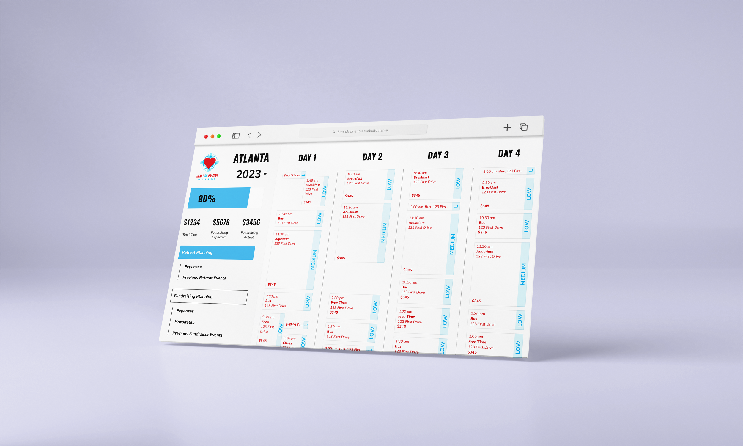
We wanted to explore as many layouts as possible in low-fidelity to ensure that we’re developing our design in the right direction. We ultimately chose Layout B to move forward with as it allows us to have more opportunities to expand features in the future. We wanted to incorporate a calendar view as a workspace for users to build the itinerary. This feature proves to be a significant improvement to the user’s current way of using a separate Google Doc to build the itinerary.

Mid-Fi: New Retreat Event Creation

Mid-Fi: Retreat Expenses
When the user is making the itinerary, they can add an event to the calendar view. When adding an event, the modal view prompts them to input in all the information that are originally fields of inputs in the Excel sheet. In addition to the basic information of the event, users can add expenses that are associated with the event such as tickets. These expenses are available to see as a whole in a separate retreat expenses tab, where a total of retreat expenses is calculated.

Hi-Fi: Fundraising Planning

Hi-Fi: Hospitality
In the same platform, users can create different fundraising events that would cover the cost of the retreats. The creation of fundraising event is very similar to the creation of retreat event where they can add basic information about the event as well as the expenses that would be required to make the fundraisers to happen. In addition, hospitality tab allows users to maintain a donor pool where they can manage and access easily.
Showing Financial Impact

As the user is filling up the calendar view with retreat events and creating fundraisers, this progress bar component at the top of the sidebar updates in real-time. Users can see how the total cost changes as they add in new expenses, and they can see exactly how far away they are from reaching their goal.
After consulting and reviewing with our client, we have arrived at a fully interactive high-fidelity prototype. With fully fleshed-out designs for all of the features, we moved on to the development semester where I worked with product and engineering managers, and six developers to fully implement the designs. The platform is currently set to deploy at the end of Spring 2024.
Dev Semester
Designer: Yiwen Zhao | PM: Aparna Arul | EM: Jay Nagpaul
Sprints Planning
Working with PM & EM

At the beginning of the semester, I worked with the Product Manager to meticulously chart out our product roadmap. This process was pivotal in establishing a clear vision and set of objectives for the team. Concurrently, I engaged in in-depth discussions with the Engineering Manager to meticulously assess the feasibility of our plans. These discussions were instrumental in bridging the gap between our ambitious goals and the practical realities of development. Based on these insights, I took the initiative to meticulously plan and organize the tickets for each sprint, ensuring that the developers had a well-defined and manageable set of tasks. This careful planning and coordination at the beginning of the semester laid a strong foundation for our project, fostering a productive and goal-oriented work environment.
Treating the Devs as the Users
Design for Dev

In an effort to streamline our development process and enhance collaboration with the development team, I devised a systematic approach to organize our Figma files. My strategy centered around creating distinct sections within Figma, each corresponding to a specific sprint. Within these sections, I meticulously marked each frame that was primed for implementation with a "ready for dev" tag. This methodical organization not only clarified which designs were finalized and ready to be brought to life in each sprint, but it also significantly reduced ambiguities and assumptions between the developers and myself. By doing so, I ensured that our communication was precise and effective, with a clear understanding of the tasks to be implemented. This approach greatly facilitated smoother transitions from design to development, fostering a more cohesive and efficient collaborative environment.
Implementation
Collaborating with Devs
Highlight #1: Calendar Event Component

The calendar event component in the calendar view is probably the hardest UI component to implement in the entire platform. Here is why: the height of the box should be adaptable to the duration of the event. For example, if a sixty minutes event is 120 px, a thirty minutes event should be 60 px. However, when you implement this change, the text inside the box cannot be simply scaled down by a proportion. The layout of the text should be discrete, meaning there should only be a number of possible layout of information hierarchy/layouts to account for all of the possible durations. Below are the examples of the possible combination of the box height based on duration of the event and the information layout.

The durations of the event are <10 mins, 15 mins, 30 mins, 45 mins, and 1 hour in the top to bottom order. The way that I created these boxes is simple: I duplicated one of the boxes and dragged the edge of the box to the half of its size. I know the height is half of its size because Figma auto-snaps the height when it is at the center of the other box. However, this proved to be an incorrect approach.

The developer who was responsible of implementing the calendar event component sent me a screenshot of this chart. It shows that the relationship between the boxes height and the duration does not lie on a linear regression. The developer asked me if this was intentional or if it should be linearly correlated.
At first, I couldn’t figure out why it wasn’t linear as Figma clearly indicated that the new box is half of the original box. As it turns out, when you simply drag the edge of the box, the height does not increment that precisely. In other words, the height may not be evenly divided, resulting in the inconsistency.
Highlight #2: Responsive Design

One of our developers approached me with a challenge concerning the implementation of a modal view. Despite following the dimensions specified in our Figma designs, he encountered an issue where the modal was awkwardly touching the top part of the screen, disrupting the intended user experience. Recognizing the importance of this feature, I collaborated with him to address the problem. We delved into the nuances of responsive design, focusing on how the modal could dynamically adjust to different screen sizes and resolutions while maintaining its aesthetic and functional integrity. Through a series of iterative adjustments and tests, we successfully modified the modal's design to be more responsive. This not only resolved the immediate issue but also enhanced the overall usability and appearance of the modal across various devices. This experience was a testament to the value of teamwork and the importance of responsive design principles in creating adaptable and user-friendly digital products.
Throughout the semester, my collaboration with the developers was a cornerstone of our project's success. I maintained a close working relationship with each developer, ensuring an open and ongoing dialogue. This continuous interaction allowed for a mutual understanding of the project's goals, challenges, and progress. By being actively involved in the development process, I could offer immediate feedback and guidance, which was crucial for maintaining the project's direction and quality. This close collaboration also fostered a team atmosphere where developers felt comfortable sharing their insights and concerns, leading to a more dynamic and adaptable development process. Through regular meetings, impromptu discussions, and collaborative problem-solving sessions, we were able to tackle challenges efficiently and innovate together. This cooperative approach ensured that the final product not only met but often exceeded our expectations, showcasing the power of teamwork and effective communication.

Testing Interactive Prototype with Real Users
Usability Test
After the development team has built out a demo of the basic functionality, I conducted five usability test sessions with the actual users of the platform. The usability testing was planned by outlining a process for evaluating a retreat planning and budget tracking prototype. It includes an introduction segment, where participants are briefed about the test, and a consent section for recording. Participants’ roles and experience levels were considered for segmentation. The test involves first impressions of the prototype, event creation, and expense management. Users’ interactions, challenges, and feedback are recorded. In debriefing, I gathered responses on how the application fits into the users’ workflow and suggests improvements to the prototype based on user feedback.
Analyzing Data From User Tests
Insights/Impact
Caused by lack of affordance (users can’t see the button).
Caused by cognitive overload (users need to also add expense and simply forgot to hit apply)
Users sometimes forget to hit “Apply” button to save changes for event time.
1.
Users showed slight preference with the “Add Time” approach once being exposed to the feature.
The mental model of adding bus events separately and only input cost in the first event works well with mentors. The mental model of the students is still untested.
“Add Time” approach is useful when adding in events retrospectively. “Add Event” approach is useful when planning the retreat without really knowing what events they want to do yet.
Users never used “Add Time” button for bus events on the first try. But they can understand the concept behind it and use it after really brief introduction to the feature.
2.
Can’t have events that overlap each other visually.
The event name should always be the most readable at the top of the information hierarchy.
Visuals on the calendar view needs significant improvements.
3.
The status bar and and the numbers at the top left are intuitive to understand.
4.
And most importantly… people loved it!
“Instrumental to making sure everyone is on the same page in real time”
“Insane upgrade to all the excel sheets and all the tabs, going to be way easier for them to use and work on at the same time, much more intuitive”
“Thank you for such an improvement”