


Designed by The Collective Design Group
Design Statement
The Urban Capillary seeks to breathe life into Atlanta by activating unrecognized space, creating meaningful spaces for urban travelers to seamlessly permeate between modes of transportation and destinations.
Meet the Collective Design Group
-

Yiwen Zhao
User Experience
-

Kush Vakharia
Concept Development
-

Hudson Musnicki
Graphic Design
-

Jared Teiger
3D Model
From September to December 2023, my Interactive Product Design Studio offered us an opportunity to delve deep into the concept of urban mobility, aiming to discover unmet needs of urban travelers while navigating within a city and developing a concept that would shape the future of urban mobility. Over the course of three months, we, known as the Collective Design Group, jointly conducted research, devised concepts, and tested models to arrive at one final concept. My primary responsibility was overseeing the User Experience aspect of the entire design process.
Design Process
1.
Understand Urban Mobility
4.
Concept Development
7.
Design Decisions
8.
Final Design
2.
Framing the Problem
5.
Auto-Valet Usability Test
3.
6.
Bike-Share Usability Test
Understand Urban Mobility
What is Urban Mobility? Why should we care?
8th
Atlanta ranked 8th in the world for the most congested city in the world.
70.8 hrs
Atlanta drivers and travelers typically spend 70.8 hours congested in traffic every year.
From liminal to memorable space, simply put, urban mobility is the movement of individuals and groups throughout the urban landscape. From taking the metro to the airport, traversing the Beltline from Ponce City Market to Krog District, or riding electric scooters to and from class, urban mobility is simply how we get around. Our goal, is to discover the essence of urban mobility and consider the future.
Framing the Problem
What can we do about it?
To address this question comprehensively, we recognized the importance of gaining a deeper understanding of the problem space and identifying our target users. The project's initial prompt presented us with a broad scope, which necessitated the need for clarity in defining the project's boundaries. At this stage of the design process, it becomes crucial to establish a clear project scope to determine which aspects of the problem space should be taken into account and which ones should be excluded from consideration.
To achieve this, we initiated the process by conducting secondary research and compiling findings in a glanceable manner. This step involved comparing and benchmarking our project's vision against a variety of external sources and references. By doing so, we aimed to gather valuable insights and knowledge from existing data and experiences, allowing us to make informed decisions about the specific direction and focus of our project within the expansive problem space of urban mobility.

We initially compiled a list of the various spaces where people interact while traveling in urban areas and organized them on a 2x2 matrix. The objective of this competitive analysis method was to gain an initial understanding of the spaces that people find most enjoyable. During this exercise, we delved deeply into three specific areas as our primary focus for conducting further user research: Beltline, Buccees, and Atlantic Station. We paid particular attention to the activities, stakeholders, and artifacts present within these spaces.

During our observations and interviews, we specifically paid attention to the activities that people were doing, the artifacts that they were using, and the people that they interact with. With these data, we are able to analyze them into research insights.
Need-Finding
What do our users need that the current space is not offering?
123
Qualtrics Survey Responses
User Interviews
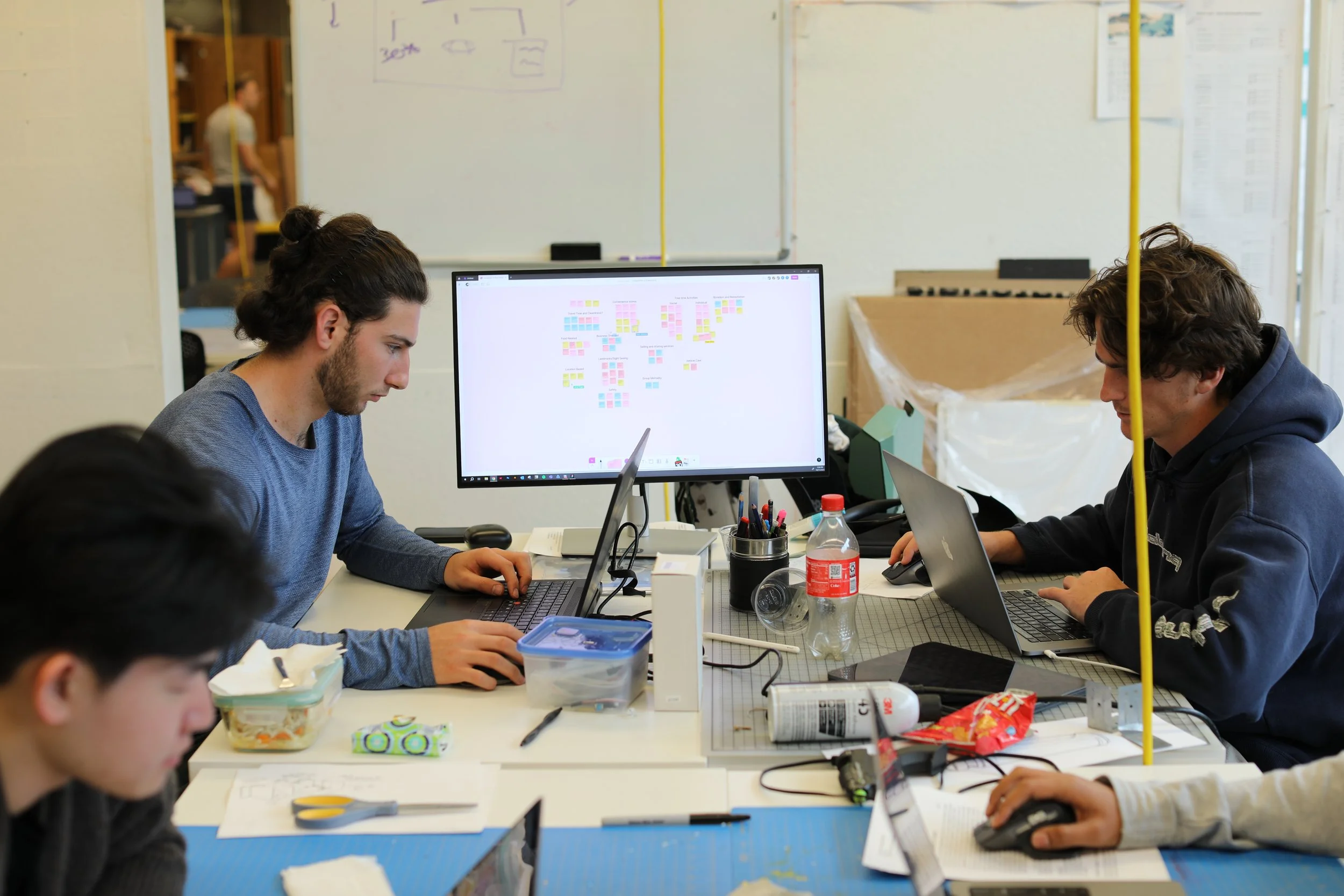
We put what our users feel, says, does, and thinks onto sticky notes in an affinity map to analyze insights.

Insight #1
13
20+
Observational Studies
Smarter integration of parking infrastructure and adjustment of idle times allow pedestrians and car drivers alike to properly utilize urban mobility hubs.

Insight #2

Our first insight pertains to maximizing the utilization of urban mobility hubs through the smarter integration of charging infrastructure and charging schedules. Based on our findings, we received input from a user who prefers using a charging hub over their own home charger due to its faster charging capabilities. Additionally, we identified another issue where individuals parking in EV charging spaces at IKEA were unable to explore the entire space because customers had to move their cars, thus vacating the charging spots. Finally, the imposition of idle fees can hinder these spaces from reaching their full potential.
The significance of distance and travel time diminishes when individuals can utilize that time in a worthwhile way.
Insight #3
A great example that we observed is the Krog District underpass on the Beltline. With lots of graffiti and open spaces, the underpass has become an extraordinary community-run destination. The key to its success is the skate park, open space for graffiti, live street music, food trucks, and numerous other unregulated activities. Furthermore, our literature reviews indicated that people tend to feel more drawn to natural green spaces, once again because of their capacity to foster a personal connection with the environment.
By allowing people the freedom to shape and personalize the space around them, it becomes memorable and facilitates the growth of community.

One of our interviewees highlighted how owning a Tesla improved her time management skills. When confronted with the fixed time requirement of charging her vehicle, she ingeniously devised a strategy to make the most of it by running errands during the charging process. In essence, she found a way to reclaim and optimize her time, turning what could have been an unproductive moment into a productive one. This adaptive approach underscores the multifaceted benefits of electric vehicle ownership beyond just environmental considerations, demonstrating how it can positively impact daily routines and time allocation.
Concept Development
Envision the Future of Urban Mobility
Armed with insights gathered from our user research and a well-defined problem space, we began the ideation phase for concepts aimed at addressing the existing challenges in urban mobility. Each team member embarked on a creative endeavor, sketching a total of 100 thumbnail sketches, each serving as a rapid and rudimentary representation of an idea. In this process, our primary emphasis was on generating a multitude of ideas, prioritizing quantity over the meticulous quality of the sketches. At the end, we ended up with a collection of 400 thumbnail sketches. From this diverse pool of concepts, we meticulously evaluated and selected the most promising 20 ideas for further development. These 20 concepts emerged as potential candidates for shaping our final concept, offering a wide range of possibilities to explore and refine in our pursuit of innovative solutions for urban mobility challenges.


Initial Concept & Features

1.
2.
3.
4.
Turbine Facade
The turbine facade will be attached to the exterior of the parking structure, supporting a portion, if not all, of the energy needed to make the building operate sustainably. This feature ties back to the research insight, highlighting the need for sustainability in the building as well as smart and efficient use of space.
Automated Valet System
The auto-valet parking structure in Urban Capillary enables users to avoid worrying about finding a parking spot in the middle of the city, as well as the security of their vehicle. Users simply need to drive into a parking bay, and the auto-valet parking structure will transport the vehicle into the system. This feature significantly reduces the time required for drivers to park their cars, thereby giving back valuable time to the users.
Bike Swap System
The bike-sharing system in the Capillary offers users a seamless transition from one mode of transportation to another. Users can park their vehicle and then get a bike to ride into the city, all within the same building and ecosystem. This feature allows users to reclaim lost time during travel, offering them a more streamlined traveling experience.
Multi-Use Outdoor Spaces
The outdoor green spaces allow travelers to pause and enjoy the urban landscape. People can use these spaces in different ways that suit their needs, from having a picnic on the grass to drawing graffiti in designated areas. The ways in which urban travelers can personalize the space and make it uniquely theirs are endless.
Auto-Valet Usability Test
Diving deep into the design of the Auto-Valet

Research Question
Will auto valet provide an increased sense of satisfaction and effortlessness with the parking experience?
Hypothesis
Auto valet makes the parking experience more streamlined.
To ensure our concept is as good as we envision it, testing is necessary to confirm that users will interact with the artifacts in the way we anticipate. A major feature we focused on and wanted to test is the Auto-Valet Parking System. As the main entrance point into the Urban Capillary, it's crucial that the user experience—from exiting the highway to entering the Capillary and parking their vehicle—is seamless. For testing our design, we adopted a rapid iterative approach, conducting as many tests as possible until reaching a clear saturation of common results. Then, we revised our test design based on the insights from this saturation and continued testing with the new design until reaching another saturation. This testing methodology allows us to remain lean while maintaining the flexibility to catch test design failures early in the process and to discover key insights about our concepts.
Test Design #1

The goal for our participants was simple: to park their car and leave the parking structure through the pedestrian exit. The driver should drive his car into “Bay 8,” leave his car, then go out to the kiosk outside to complete the car parking procedures. That is the happy path and, just as expected, none of the participants performed the happy path.
0%
Completion Rate
“I thought it would take my car... you said it was automatic valet. Right?”
User Quote
What we found is that none of the users chose to drive directly into the parking bay; instead, they drove towards the kiosk outside the bay and interacted with it without leaving their cars. It turns out there is an existing mental model where people prefer to interact with the kiosk before believing they are allowed to park. The placement of the kiosk and signage is paramount in achieving the intended happy path. Previous mental models overruled our intended outcome.

Test Design #2
To address the issues that we found, we have updated the kiosk placement for better way-finding communication. Instead of having the kiosk on the outside of the parking bay, we put them towards the inside and at the same side of the driver’s seat. This placement clearly indicates the intent of the parking procedure where the driver needs to drive into the pay to interact with the kiosk.

Insights Finding
Insight #1
Mental models for car parking structures were challenged while testing automated valet parking.
The current mental models of users differ from how we envision our concept being used. The novelty of the concept should not be entirely unfamiliar to the audience. We need to refine our concepts so that they leverage existing mental models, guiding users naturally and intuitively through the overall journey.
Insight #2
Some users considered safety and security of their car as a bonus but some also worried about how the system would ‘treat’ the car.
One unexpected insight from our participants is their appreciation for the security aspect of our concept. They find the idea of driving into a parking garage, where no one else can access their car afterwards, very compelling. However, they also expressed concerns about potential damage to their car by the auto-valet system. This apprehension stems from a lack of understanding of how the auto-valet parking system operates. Better communication is necessary to alleviate users' concerns regarding the parking structure.
Bike-Share Usability Test
Diving deep into mode of transportation switch

Another feature closely associated with our Urban Capillary is the CapCard ecosystem. Users can utilize the CapCard at various touchpoints during their urban travel experience. It enables them to park their vehicle, rent a bike, access the subway, and more, all with a simple tap. Users have the option of obtaining a physical card for their wallet or integrating the CapCard natively into digital wallets like Apple Wallet. Therefore, it is crucial to validate whether our envisioned interaction, particularly the transition from one mode of transportation to another, is seamless.
Insights Finding
Research Question
How do users understand the CapCard ecosystem and apply it to switch between different modes of transportation?
Hypothesis
The CapCard ecosystem makes urban traveler’s experience more streamlined.

Insight #1
Kiosk labeling and first screen helped people understand whether or not the kiosk services applied to them
Adding a “help desk” sign to the kiosk helped users identify the interaction point. The majority of participants chose not to interact with the help kiosk and instead walked straight to the bike. This signage proved successful, as users indicated that they didn't need help, so it was natural for them to tap the CapCard and check out a bike.
Insight #2
Auditory cues can ease cognitive load and provide feedback to increase the user’s understanding of what’s going on significantly.
The majority of participants had difficulty understanding whether their bike had been successfully locked, despite clear indications on the bike's UI confirming that it was locked. We found that there are simply too many distractions at the moment when a user tries to lock their bike. As a result, the user's attention shifts from the screen to the bike's wheel and the station's locking mechanism.
Insight #3
Users have no problem understanding the pass ecosystem. With better context clues and graphics we can increase this understanding as well.
All our participants understood that the same CapCard used for parking their vehicle should also be used to rent a bike. People had no trouble comprehending the overall CapCard Ecosystem. However, we still see opportunities for improvement, such as redesigning the card itself to better communicate the ecosystem.
Design Decisions
Driving Final Design through Evident-Based Research

1.
2.
3.
4.
CapCard Redesign
By redesigning and giving life to the CapCard itself, we are able to better communicate the mental model of the ecosystem while giving our users a snazzy artifact to hold for their daily commute.
Auditory Cues for Bike Locking/Unlocking
Having multi-modal communication method would ease the cognitive load for out users. The feedback also ensures our users is always informed of what the system is doing to their bike, thus, better experience for their journey.
Giant Displays of Communication for Parking
Having displays inside the parking bay allows us to have a lot of opportunities to communicate with the users what we want them to do and what the system is doing.
Simplify and Make Design Consistent Across the Entire Ecosystem
Establishing a consistent mental model across anything a user can find in the Capillary and the ecosystem ensures our users are always familiar with each point of interaction at any point of their urban journey.
Final Design
Introducing the Urban Capillary & CapCard Ecosystem


